aA.M.C. Davies and bTom Fearn
aNorwich Near Infrared Consultancy, 75 Intwood Road, Cringleford, Norwich NR4 6AA, UK
bDepartment of Statistical Science, University College London, Gower Street, London, UK
Introduction
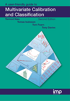
I wrote a column early this year about Process Analytical Technologies (PATs), in which I had talked about the urgent need for education. This combined with some very welcome feed-back from some friends to make me realise that I had been working under a false assumption. I have been editing this column for a long time (12 years in SE and four years in its parent, Spectroscopy World). But I assumed that all readers would be knowledgeable about the subjects I had discussed in previous columns. By chance, the first ever TD column was about one of the most important tools in chemometrics, Principal Component Analysis (PCA).1 Since then PCA has been mentioned frequently but never explained. I now realise that there must be many readers who have joined us in the last 12 years who only have a vague idea about what PCA is, how you use it and what it can do. For those of you I left behind I offer apologies and this column as a beginners guide to PCA, which has been prepared in collaboration with Tom Fearn. Next year there will be a second part to PCA; then we are planning to write further guides to introduce (or re-introduce) additional basic chemometric techniques. Some of the pictures in this article may seem familiar to some readers. If you have been on one of our courses or have a certain chemometric textbook;2 then you are partially correct. The idea has been used before but all the calculations are new. – Tony Davies
What is PCA?
PCA is a mathematical method of reorganising information in a data set of samples. It can be used when the set contains information from only a few variables but it becomes more useful when there are large numbers of variables, as in spectroscopic data. What PCA does is to discover new variables, called “Principal Components” (PCs), which account for the majority of the variability in the data. This enables us to describe the information with considerably fewer variables than was originally present. In terms of near infrared (NIR) data, which we will use in this demonstration, we may start with data from a spectrometer which makes measurements every 2 nm over the range 1100–2498 nm. Thus we start with 700 variables, but the first 20 PCs will contain almost all of the information.
The rules for computing PCs are quite simple. The first PC is the direction through the data that explains the most variability in the data. The second, and subsequent, PC must be orthogonal (at right angles) to the previous PC and describe the maximum amount of the remaining variability. Once we know the directions of the PCs it is simple geometry that allows us to express the values of individual samples in terms of the PCs as linear summations of the original data multiplied by a coefficient which describes the PC. These new values are known as “scores” and each sample will have a score for each PC (just as it had a value for each of the wavelength variables in the original data).
While the rules for PCA are quite simple, the mathematics required to calculate them are quite complex. Happily, you do not need to understand the mathematics, but you do need to have a generalised idea of what is happening and we can find this if we take the case where there are just three variables in the original data.
Preparation for the demonstration
What we want to show is the use of PCA with increasing numbers of variables. In order to do this we need to prepare some data by going in the reverse direction. We start with visible and NIR spectra for a set of 153 samples of pharmaceutical tablets, which was part of the data made available for the “Software Shootout” at the International Diffuse Reflection Conference in 20023 that is becoming a very well-used dataset. The original data spanned the range 600–1798 nm at 2 nm intervals, but for this demonstration, we will start with a set with data from 600 to 1624 nm which contains 513 variables, Figure 1. Figures 2–4 show the plots after the data had been reduced to 57, 19 and 3 variables. In Figures 3 and 4, the datapoints are sufficiently separated, along with the wavelength axis, to plot them as separate points rather than represent them as continuous lines. You will see that for the final reduction to three points the wavelengths have been selected, while in the other cases the retained data is at equal intervals. This was necessary to make sure that there was interesting information in the three variable set.
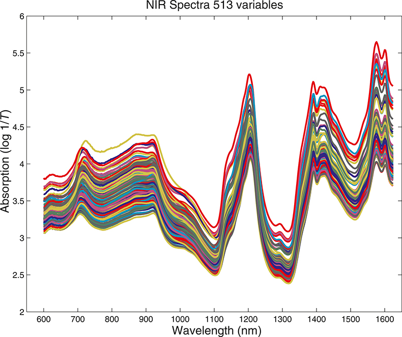
Figure 1. Visible/NIR data for153 samples with 513 variables.
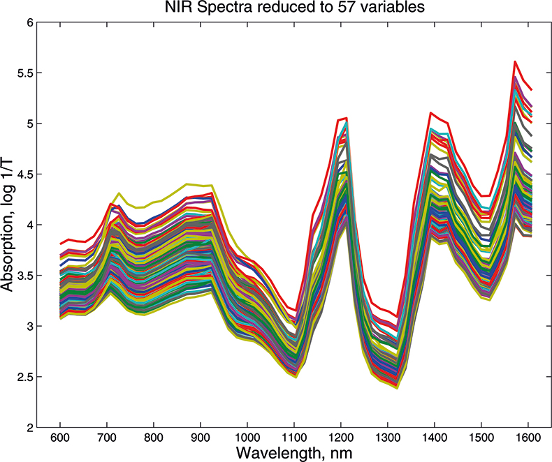
Figure 2. Visible/NIR data for153 samples with 57 variables.
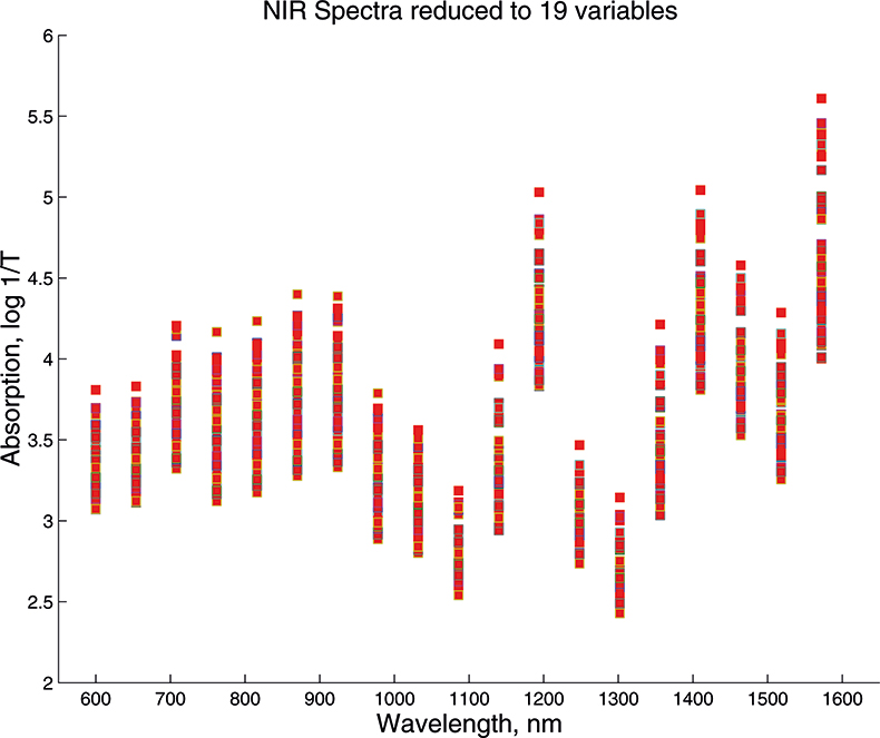
Figure 3. Visible/NIR data for 153 samples with 19 variables.
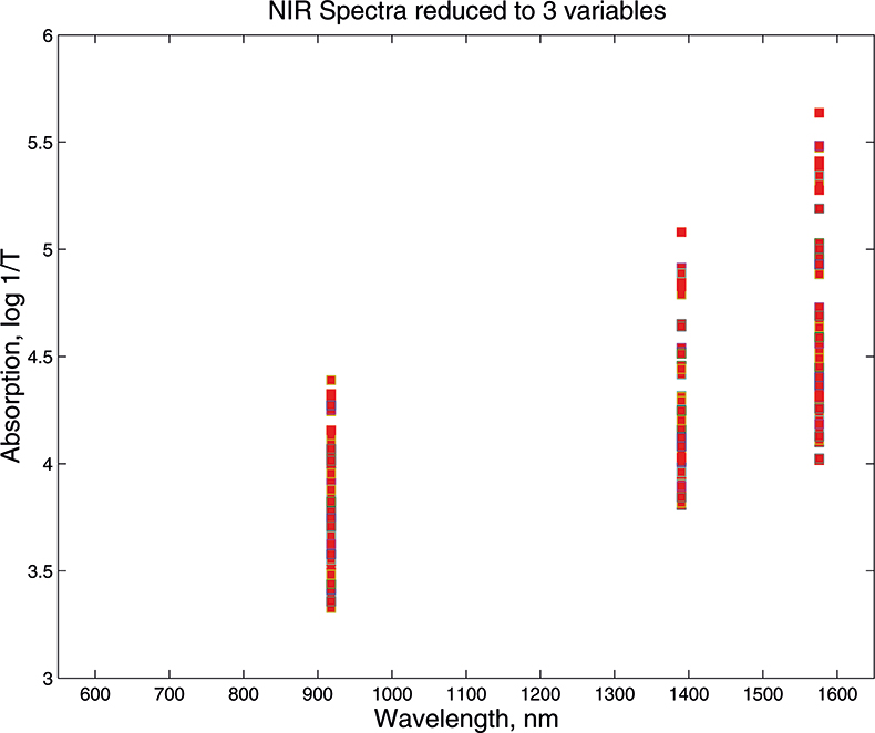
Figure 4. Visible/NIR data for153 samples with three variables.
PCA in pictures
If we have just three variables we can plot them in a three-dimensional space as in Figure 5. You can see the 153 samples each represented by a circle positioned according to the values of the three variables. Three of the samples are highlighted so that you can see how the distribution moves; they are not special samples. Before we begin PCA, we need to centre the data so that it varies around zero. This is done by calculating the mean values of each of the variables and then subtracting these values from each measurement of a variable. When we plot the centred data, Figure 6, there is no change in the distribution of samples. Now we are ready to start the PCA! In Figure 7 the black line shows the direction in which there is maximum variation in our three-dimensional data, as measured by their variance. This is the axis of the first PC. The value of the new variable for any particular sample is found by projecting the point on to the axis, which means that we find the point on the axis which is nearest to point representing that sample in the three-dimensional space. This point can be found by drawing a perpendicular line from the point to the axis. These values are the scores on the first PC.
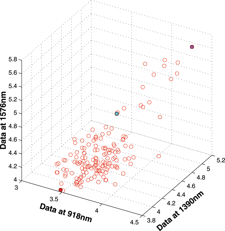
Figure 5. 153 samples measured on three variables.
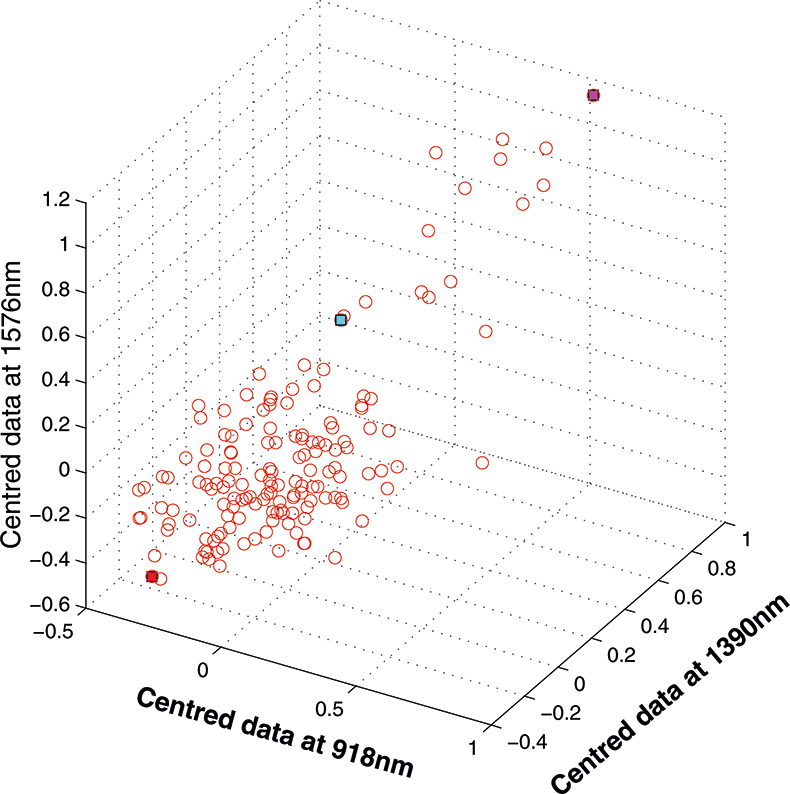
Figure 6. Centred data from Figure 5.
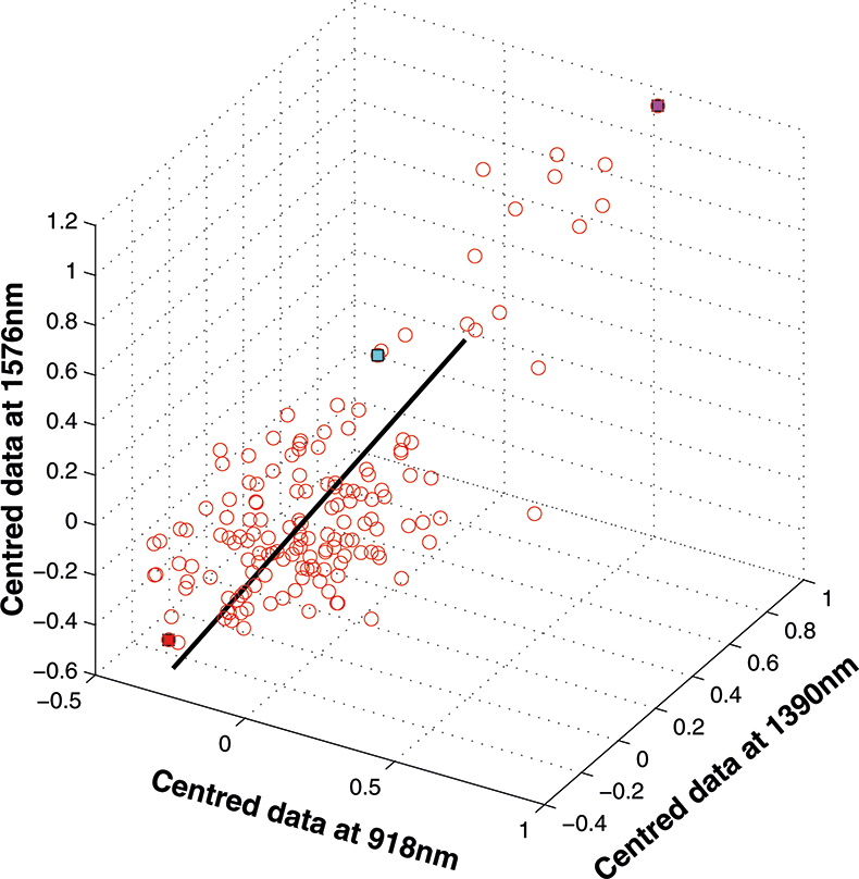
Figure 7. First PC plotted in the three-dimensional space.
The axis for the second PC is shown as a blue line in Figure 8. This line is to be at right angles to the first PC and oriented to the direction of maximum remaining variability. The third PC is added in Figure 9 as a green line. As it must be at right angles to both of the first two PCs there is only one possible direction left and it captures the remaining variability. Note that the PCs all have a common origin which is the origin of the centred data.
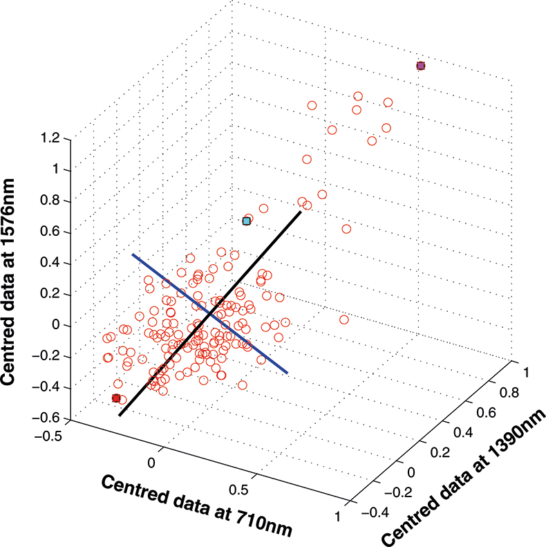
Figure 8. The second PC added to the three-dimensional space.
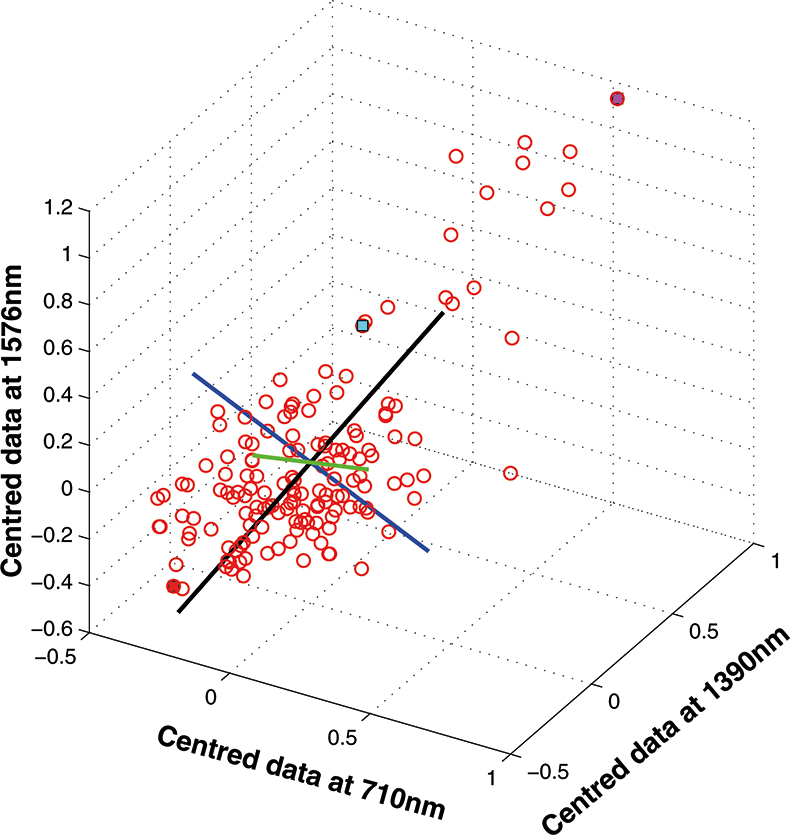
Figure 9. The third PC added to the three-dimensional space.
As well as producing a set of scores for each sample on each PC, PCA also provides the coefficients used to compute them; these are known as weights. Figure 10 is a plot of the weights for each PC plotted against the variable number. PC1 is seen to be quite flat; this is quite common with NIR data because the spectra are often affected by variation in path length (often caused by variation in particle size or distribution). PC2 is mainly influenced by the first variable, while the third PC has large weights (but opposite signs) for the second and third variable. As we shall see later these weight plots become more interesting when we have a larger number of input variables.
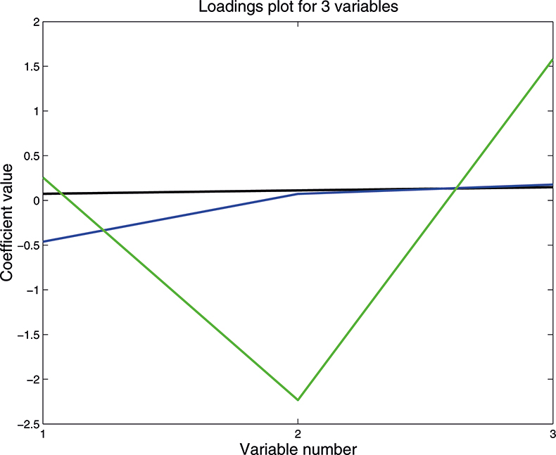
Figure 10. Plot of the weights for each PC. 1st PC; 2nd PC; 3rd PC.
There are several important points to be made at this stage:
- If you understand this three-dimensional case then you understand the general case with large numbers of variables. The mathematics does not change with increasing dimensions; the matrices get larger and the computer might take a whole second to do the computation. So say “seven hundred variables” and think three dimensions!
- The sign of the scores has no meaning in PC space. A change of one sample might cause the calculation to flip from positive to negative.
- The real use of PCA is not to analyse three-dimensional data but to reduce the dimensionality of data with much larger number of variables. Most data can be reduced to less than 20 PCs and retain a very high percentage of the information content; probably better than 99.9%.
- An important property of PCA scores is that they are uncorrelated.
Although we can draw three dimensional figures on a two dimensional sheet of paper it can be difficult to visualise the three-dimensional distribution. On a computer screen and with the right software the cloud of points can be rotated, which makes it much easier. So when we are constrained to paper it is often better to restrict plots to two dimensions of one PC against another. As the first PC appears to be mainly concerned with pathlength/particle size variation, for this demonstration we plot PC2 against PC3 which for the three-dimension data is shown in Figure 11. This picture can be visualised by rotating the three-dimensional picture until we are looking straight down the first PC, so we see only a two-dimensional representation of the cloud of points. When you can visualise PCA by this sort of manipulation you will understand why mathematicians talk about “rotation”.
PCA with more than three variables
We cannot draw pictures to represent four or five dimensions so that when we have more than three variables we can no longer plot pictures such as Figure 9 to look at the position of the PC in our multi-dimensional cloud of points. We have to imagine this and then look at plots of the weights against the input variables (such as Figure 10) and two-dimensional plots of PC scores (such as Figure 11). Figures 12–14 show the weight plots from the PCA of the data with 19, 57 and 513 variables for the first five PCs.
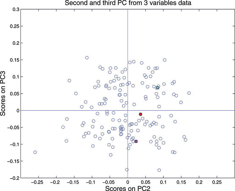
Figure 11. Plot of scores on PC2 against scores on PC3 for 153 samples in the three-variable data set.
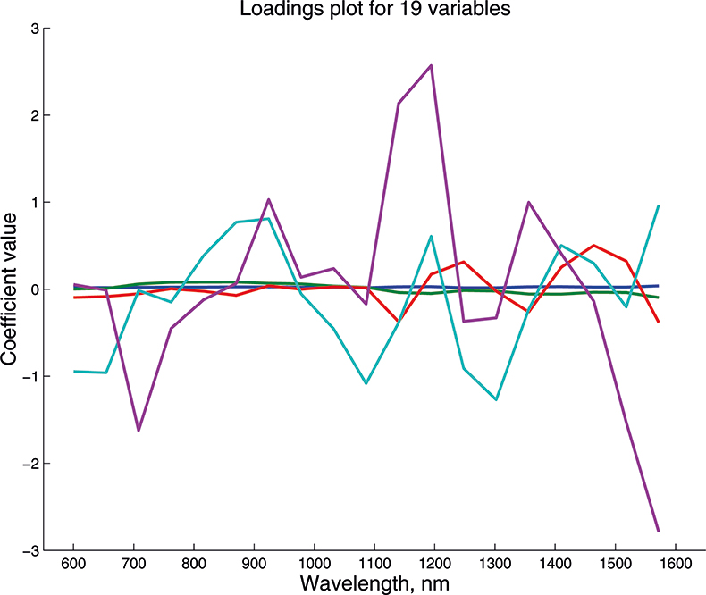
Figure 12. Weights plot for first five PCs for the 19-variable data.
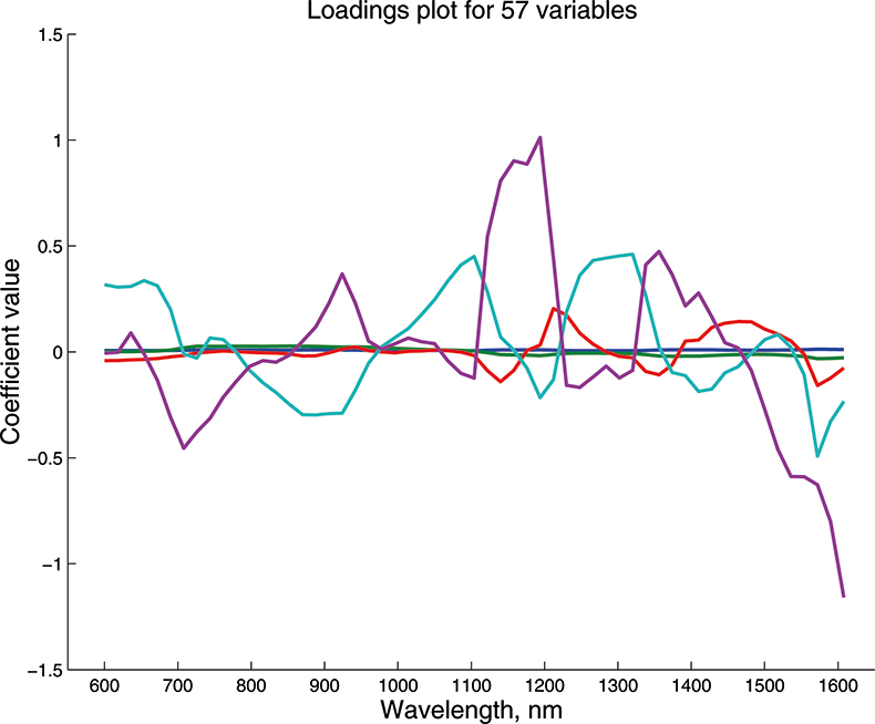
Figure 13. Weights plot for first five PCs for the 57-variable data.
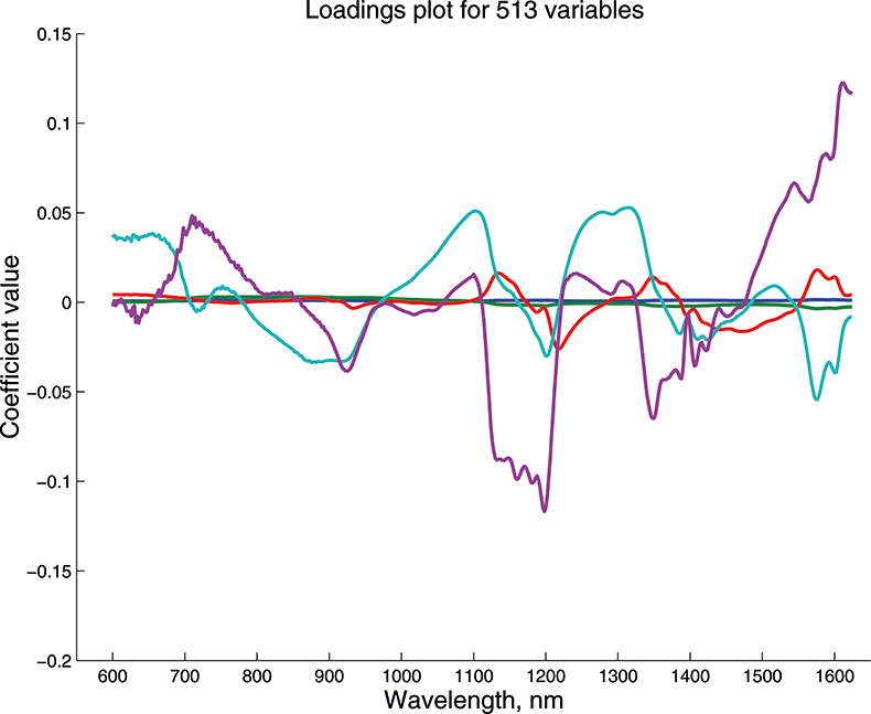
Figure 14. Weights plot for first five PCs for the 513-variable data.
These figures are remarkably similar, except that the signs have “flipped” in the 513 variable set. As we know where the data has come from the similarity is not surprising. The extra detail on the 5th PC in Figure 14 is probably real information and not noise. The final three plots are for the second and third PC scores plots for each of the data sets. As the weights plots were similar we expect these plots to also be quite similar and they are if you allow for the “flipped” signs in the weights for the 513 variable data set.
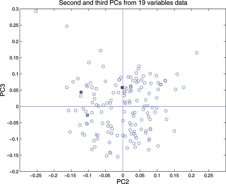
Figure 15. Plot of scores on PC2 against scores on PC3 for 153 samples in the 19-variable data set.
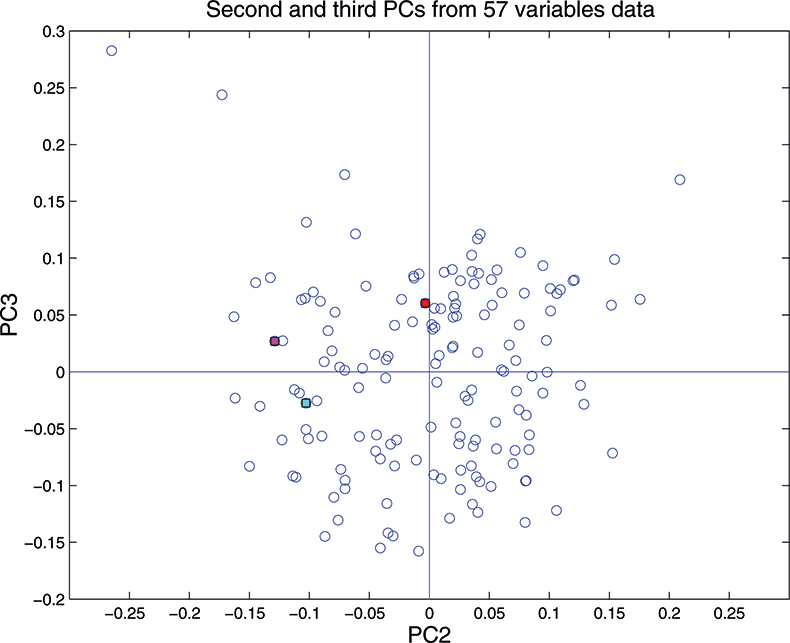
Figure 16. Plot of scores on PC2 against scores on PC3 for 153 samples in the 57-variable data set.
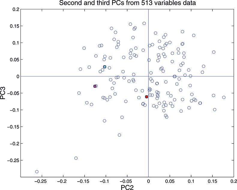
Figure 17. Plot of scores on PC2 against scores on PC3 for 153 samples in the 513-variable data set.
In the next column in this series, we will explore the major applications of PCA in spectroscopic data.
References
- A.M.C. Davies, Spectrosc. Europe 4(2), 38 (1992).
- T. Næs, T. Isaksson, T. Fearn and T. Davies, A User-Friendly Guide to Multivariate Calibration and Classification. NIR Publications, Chichester (2002).
- D.W. Hopkins, NIR news 14(5), 10 (2003).


